Brand Identity
Case Study
BIOSENSE Branding
Creative SPIN
A fresh set of eyes on a local start-up looking for help in the marketing and communication department.
We met the BioSense team through a local business centre that helps SME’s and start-ups develop and grow. They were quite honestly in dire need of a helping hand when it comes to brand identity, sales material, and general promotion.
We were, as you can image, thrilled to offer our services, and we think the outcome was pretty damn good.
Brand Design
The BioSense brand is a creative spin on the live-cell imaging provided by the company’s main product, oCelloScope.
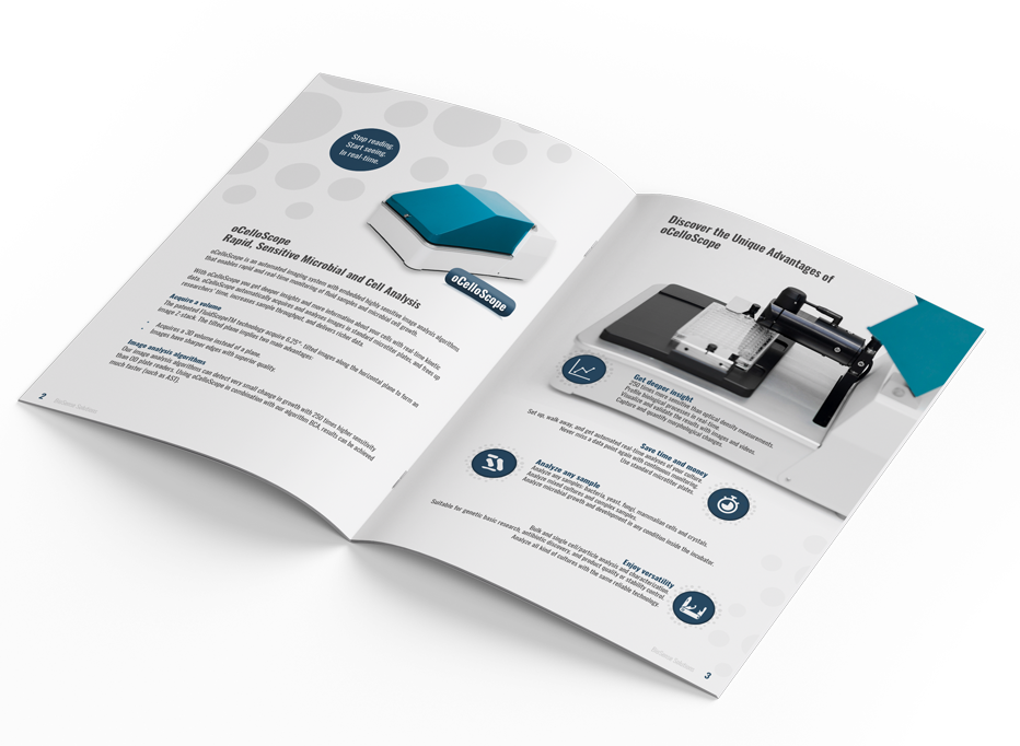
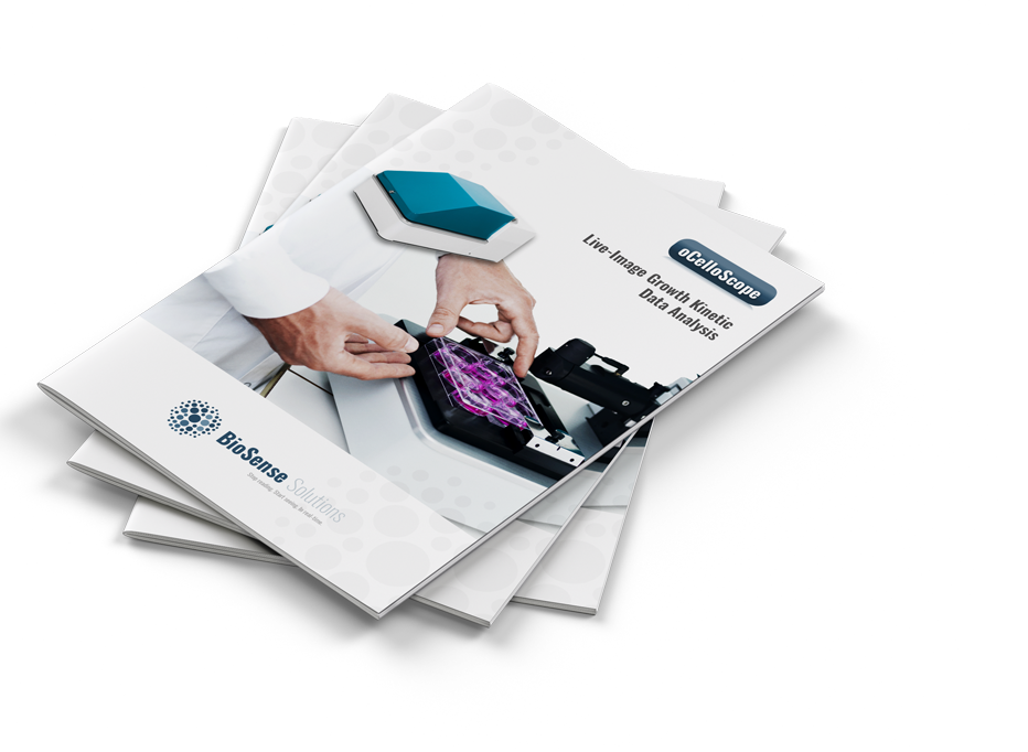
Brochures & Fact Sheets
BioSense’ sales material got a massive facelift with the fresh brand, colour scheme, and copy direction.
Expo Design
We equipped BioSense with a new easy-setup expo wall which drew rave reviews on debut in Germany.
Online Work
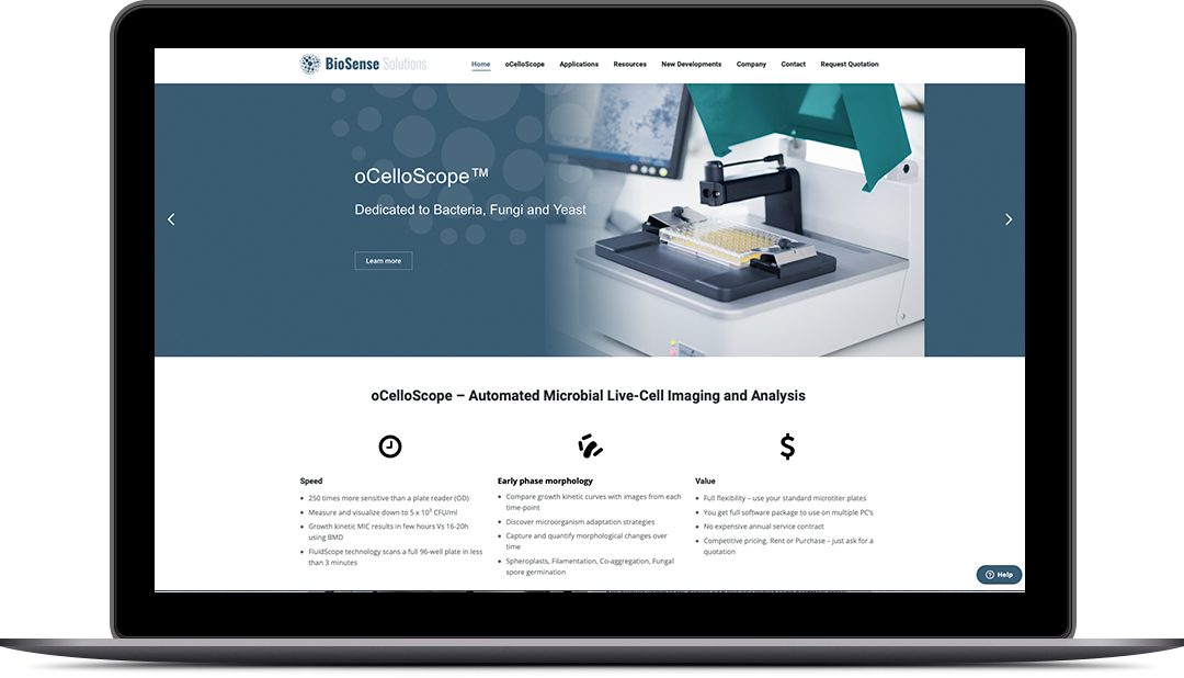
Last but not least, we tweaked BioSense online profiles to match the new brand image.
ICON Design
To make an otherwise complex topic easier to digest, we designed new icons to better visualise and explain away some of the more “heavy” content, with intricate technical and biological descriptions.
Visual Storytelling
Creative Elements


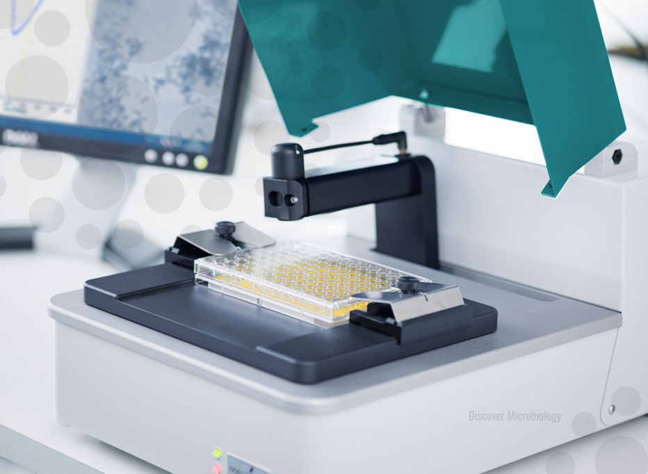
BioSense had recently invested in a new website when we first connected, so that wasn’t a big part of the project, but we did supply them with some new header photos, and made a few tweaks here and there to better suit the new brand identity.


